
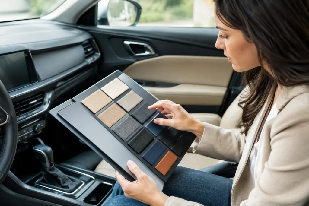
A steering wheel can be perfectly reupholstered and still look wrong if its color fights the dash, console, or door panels around it. That is why a guide to matching automotive interior colors has to go beyond choosing something that looks close in a product photo. Interior color matching is a material, finish, lighting, and age problem – and getting it right is what separates a repaired part from an interior that looks factory new.
For a classic restoration, the goal may be faithful OEM accuracy. For a custom build, the goal may be a richer, more current color combination. Both require the same discipline: identify the existing materials, evaluate the parts in proper light, and make every finish look intentional.
Start With the Interior, Not a Color Name
Automakers use broad names such as black, tan, gray, red, parchment, or saddle. Those names are useful starting points, but they are not specifications. A “tan” interior may lean yellow, orange, olive, or pink. A black interior can be blue-black, charcoal-black, or warm black. On top of that, the same interior color can appear different across leather, molded plastic, painted trim, carpet, and woodgrain.
Before choosing leather, dye, paint, or suede, look at the entire cabin. The dash, upper door panels, seats, console, headliner, carpeting, pillars, and steering wheel all influence what your eye reads as the dominant color. In many vehicles, the dash is the best reference because it is large, central, and less likely to have been replaced with an aftermarket piece.
A vehicle identification number, factory trim code, build sheet, or original dealer documentation can help establish the intended color family. It does not eliminate the need for a physical comparison. Production variations, prior repairs, sun exposure, and decades of use can make a correct factory code look noticeably wrong next to the interior now in the vehicle.
The Four Variables Behind a Good Color Match
Color is only one part of the result. When matching automotive interior components, evaluate hue, value, saturation, and sheen together.
Hue is the basic color direction: is the brown more red, yellow, or gray? Value is how light or dark it is. Saturation describes intensity – whether a color looks clean and vivid or softened and muted. Sheen is the level of surface gloss, from low-gloss and matte to satin or more reflective finishes.
Sheen is often where otherwise good restorations fail. A repaired console painted in the correct shade can look out of place if it has too much gloss beside a low-sheen dash. Likewise, a leather-wrapped steering wheel may look mismatched even when the leather color is accurate if its grain, texture, or topcoat reflect light differently than the seats.
Texture changes the way color is perceived. Smooth leather reflects light in a different pattern than perforated leather, Alcantara-style suede, molded vinyl, or soft-touch plastic. Woodgrain and carbon fiber introduce another layer because their pattern, depth, and clear finish affect the overall warmth or contrast of the cabin.
Why lighting changes everything
A color sample viewed under bright shop LEDs may shift dramatically in direct sun or at dusk. This is called metamerism: two colors appear to match under one light source but separate under another. It is especially common with grays, beiges, reds, and darker browns.
Check samples in natural daylight, shade, and the lighting where the vehicle is most often seen. If the part will sit directly in front of the driver, such as a steering wheel or dash trim, even a small shift can be obvious. A close match on a lower console panel may be more forgiving, but it still needs to belong with the rest of the interior.
How to Match Automotive Interior Colors for Restoration
Factory-correct work begins by deciding what condition you are matching. There is a difference between matching a surviving, aged interior and reproducing its original showroom appearance.
If the seats, dash, and door panels remain in good original condition, matching their current appearance usually produces the most cohesive result. A newly restored steering wheel should not look brighter, glossier, or more saturated than the cabin it returns to. In this situation, a carefully adjusted match can look more authentic than an untouched factory formula.
If the entire interior is being restored, you have more freedom to return to the original color specification. This is often the right route for collectible vehicles, concours-minded restorations, or cars where multiple faded components are being refinished at once. Consistency across all restored parts matters more than preserving the faded tone of one old panel.
Send a representative reference part whenever possible. A removable dash bezel, console lid, trim piece, or old steering wheel cover provides a much stronger match target than a phone photo. If the reference piece has faded unevenly, note which surfaces have been protected from sunlight. The back side of a removable trim panel may reveal the original tone, while the visible face shows the color the rest of the cabin has aged into.
Leather, Vinyl, Plastic, and Paint Do Not Match the Same Way
A premium result requires material-specific methods. Leather is typically matched through the leather itself, its grain, and its final protective coating. Plastic and vinyl parts may require cleaning, preparation, adhesion-promoting steps, flexible coatings, and the correct sheen level to withstand daily contact. Painted metal trim has different requirements again.
Trying to force one finish across every material can create a patchwork appearance. For example, leather seats and a leather steering wheel may use a related color, while the adjacent dash plastic needs a slightly adjusted formula and flatter finish to appear identical from the driver’s seat.
This is also why off-the-shelf spray colors can disappoint. They may be close enough in the cap or online image, but they rarely account for your vehicle’s age, grain, surrounding materials, and factory sheen. They also may not hold up on high-touch parts such as steering wheel spokes, shifter surrounds, armrests, and door pulls.
At Craft Customs, color work is approached as part of the full restoration process. The component, material, surface condition, and adjacent interior pieces all determine the right direction – whether that means a faithful OEM-style finish or a deliberately updated custom color.
Building a Custom Interior Palette That Looks Expensive
Custom does not mean every component needs a different color. The strongest custom interiors usually rely on a disciplined palette: a primary color, a secondary color, and one controlled accent.
A black cabin with dark red stitching and matching red shift boot details can feel focused and performance-oriented. A warm brown leather steering wheel with satin woodgrain trim can bring a classic luxury interior together. Charcoal leather paired with a subtle blue-gray suede accent can modernize an older cabin without making it feel trendy or overbuilt.
The key is proportion. Reserve the boldest color for smaller visual areas unless the entire interior is being redesigned. A bright accent works well in stitching, center markers, shift boots, piping, or carefully selected trim. Covering large sections of the dash and seats in competing colors can make even premium materials look busy.
When selecting custom colors, account for exterior paint only after the interior itself works. A red exterior does not require red seats, and a blue vehicle does not automatically need blue trim. The cabin should feel cohesive with the vehicle’s character, but it has to be comfortable to live with from the driver’s seat.
Keep finish levels coordinated
A custom palette can fail when the finishes do not agree. Matte suede next to glossy painted trim often needs a satin bridge, such as leather with a moderate sheen, to keep the transitions refined. Carbon fiber may look right with black leather and dark metallic accents, while high-gloss woodgrain is generally more at home with warmer leathers and classic tones.
The right combination depends on the vehicle. A vintage truck, a European luxury sedan, and a modern track-focused coupe should not be treated with the same design rules.
Common Mistakes That Make a Match Look Wrong
The first mistake is matching from a single phone photo. Cameras automatically adjust white balance, contrast, and exposure, while screens display color differently from one another. Photos are useful for discussing direction, but they cannot replace a physical reference.
The second is matching only the new part. A fresh steering wheel in perfect black leather can look too dark beside faded charcoal seats. In that case, the repair may be technically excellent but visually disconnected. Evaluate every part that will sit within the same sightline.
The third is ignoring wear patterns. The top of a dash, upper door panels, and steering wheel are exposed to heat and UV damage. A match based on a protected lower panel can look too rich when installed beside sun-faded upper trim. Decide whether you are restoring the whole group of parts or blending one restored piece into the cabin as it exists.
Finally, do not treat durability as separate from appearance. A high-contact surface needs coatings and materials appropriate for friction, skin oils, cleaning products, and temperature swings. A finish that matches beautifully on day one but wears prematurely is not a successful restoration.
A Better Way to Choose Your Color Direction
Begin with clear photos of the full interior in daylight, then photograph the specific part from several angles. Identify whether your priority is factory accuracy, a refined upgrade, or a complete custom redesign. If possible, provide a removable physical sample and explain which interior pieces are staying untouched.
Be specific about what bothers you now. Is the steering wheel too faded compared with the seats? Is the woodgrain too orange for a black-and-gray interior? Are peeling soft-touch plastics making an otherwise clean luxury cabin feel worn out? Those details help determine whether the correct answer is a near-invisible blend or a coordinated transformation.
The best color match is not always the one that looks most dramatic in a standalone photo. It is the one that makes you sit in the driver’s seat, look across the dash and wheel, and feel that every surface was meant to be there.